Dashboards have a crucial role for companies, allowing them to visualize their data and to make intelligent decisions. Their effectiveness will depend largely on their design.
Dashboards are a key tool for today's business, providing visibility and shape to all its data. They have gone from being a merely informative tool to an analytical tool that facilitates daily decision making. The elements that make them up, as well as their design, will determine their usefulness and readability within each company.
The focus when designing a Dashboard has to be on the user experience, so it is essential to always keep the following points in mind:
- Who it is for
- What are your needs and features
We are not saying anything new when we say that most people learn and remember better what they see, so a well-designed Dashboard will facilitate communication between people who see it, ensuring correct interpretation of the data and encouraging their memory and interest.
Taking into account the above, the following are 7 tips to design effective Dashboards, which allow to make profitable the company's data.
1. Carry out a correct contextualization
A Dashboard that is not well contextualized can generate a loss of interest in the people who see it, who will go from considering it useful to seeing it as something meaningless or difficult to understand.
That is why each Dashboard must be thought out and designed for the type of users it is intended for, so that it is productive, useful and convenient to analyze.
At this point it is also desirable to help users in their search for data, as well as possible problems that as a company need to be raised, so that the Dashboard is a comprehensive tool that covers the maximum data of the company, but at the same time is intuitive and provides answers to all those questions that arise as a company every day.
2. Test the Dashboard view with the end user, throughout the process
A Business Intelligence specialist's view of a Dashboard may be very different from that of a non-business intelligence expert. With this in mind, it is very important to work from the beginning and throughout the process with the end user to ensure that what you are trying to communicate is what is actually reaching the recipients.
3. Explain to the end user how to use and get the most out of Dashboards
In this section it is important to create a plan or guide so that any user who needs it, can consult and resolve their doubts regarding the use of the Dashboard. It’s important to explain the objectives of the panel, how to read the results obtained and what they mean for the company.
In addition to that, it would be advisable to make an initial demonstration in which the person who has prepared the Dashboard, shows all the details and solves the doubts that may arise. Those who are present at that demonstration will be able to guide the rest of the users.
4. Leverage the design process to standardize data
Depending on the person, department or company, the data will be defined in one way or another. The variation can be enormous and this can lead to incorrect interpretations of the data.
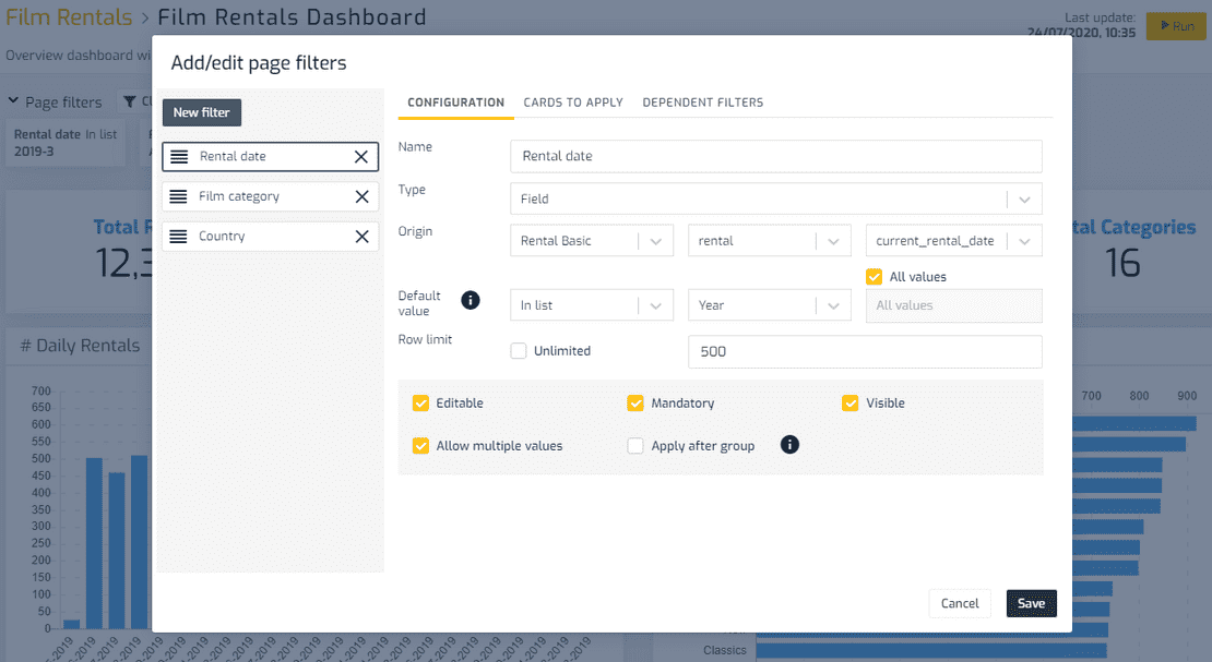
When designing a panel, it is necessary to establish standardized guidelines for all members of the company. Having a KPI catalogue (Key Performance Indicators) in the company, is undoubtedly of great help, as it allows all users to have a clear:
- Definition of each KPI: its name and what it means. It is very useful to include in the Dashboard not only the name of the indicator, but a clear description of its meaning, agreed and standardized in the company.
- The formula that has been used to calculate the KPI. This means that there is no doubt in the company about a certain indicator, and two people cannot arrive at different values for it, applying the same criteria.
- The data sources that feed the information for the calculation of the KPI. This way the more technical users can know which information systems are involved (ERP, CRM, external applications, APIs, etc.) in order to detect, for example, errors in the values shown.
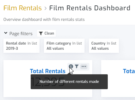
For example, in Biuwer you may set up a KPI type card this way:
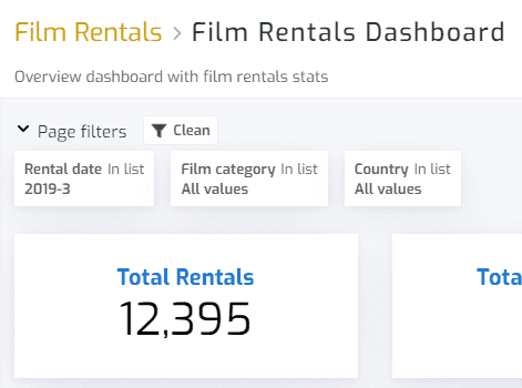
But to show the end user the information needed to know the context, a description including the meaning can be configured:
5. Establish the steps in the Dashboard design process
The design of a Dashboard requires a process of continuous improvement to ensure good results. This process is reflected in the following steps:
- Identify user needs.
- Evaluate the data and work together with users to design a Dashboard that fits their needs.
- Consider the comments of future users to make the necessary modifications, in order for the Dashboard to fulfill its expected function. This will minimize future problems.
- If after making a revision, modifications are made, go back to the first step with the required changes.
6. Thinking of the user
A panel that is dynamic and allows different analyses to be made, to different work groups, depending on their needs, will be infinitely more useful than a rigid panel with a single design for all.
For this it is very useful to use a powerful system of filters, which each user can customize individually. Why? Because the questions each user can ask will be unique and the Dashboard must be able to answer all of them at once and in a personalized way.
7. Remove KPIs that are not required
Quantity is not synonymous with quality when it comes to including data in a Dashboard.
If a person has access to a lot of data that is not useful or necessary for their task, it is easy for them to lose attention or become confused when interpreting what they are seeing.
That is why it is important here to show only what is necessary for each user in the context being analysed.
To do so, it will be essential to understand how users will use the information, so that we can anticipate their needs.
Rather than trying to solve multiple casuistics with a single Dashboard that contains too much information and is difficult to interpret, it is preferable to create several Dashboards to answer sets of limited questions and that can be analyzed in a clearer context.
Summing up...
If you want to know more about how to use Dashboards in your company, the Biuwer team will help you make the leap. Contact us, we will accompany you throughout the process, offering you the best options for improving your company's performance and without the need for prior knowledge.