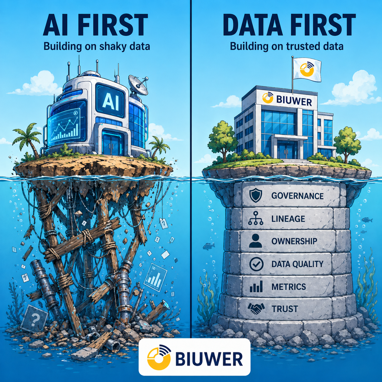
Whether or not you are used to working with data on a day-to-day basis, you may have found it difficult to understand its meaning. I think we've all suffered the endless data sheets where it's impossible to know if a number is a good thing, a bad thing, or simply has a value that leads to concrete action.
What is Data Visualization?
According to Wikipedia's definition of Data Visualization, it "refers to the techniques used to communicate data or information by encoding it as visual objects (e.g., points, lines or bars) contained in graphics".
If we use an everyday language, we can say that Data Visualization is the act of communicating data in a visual way so that they are understandable, easily interpreted and can be analyzed visually, to discover patterns like:
- Trends: growth, decrease or constancy
- Rankings: ordered groupings indicating greater or lesser importance
- Comparisons: between two periods or any other dimension of analysis
- Dispersion: ability to detect outliers or abnormal behavior
The data to be analysed
The first step to build a Data Visualization with any tool is precisely the data. Today there are literally hundreds of different types of data sources, which are used more or less often depending on the type of company and what data you want to analyze.
These are some types of data sources that a company can use:
-
Databases, containing different types of information depending on whether it is an ERP (Enterprise Resource System), a CRM (Customer Relationship Management) or any other type of application (support, document management, payment management, etc.). They are usually the main data sources used by companies and in which they have updated information every day.
-
Files of various formats: CSV, Excel, JSON, XML, etc. These types of data sources are very common, as it is easy to export our data in any of these formats from any tool.
-
Cloud apps. There are hundreds of cloud applications that allow access to data that is managed in various ways. Examples: a cloud billing application, or a social network you use in your company.
-
APIs. Today's world is (and will be even more) hyperconnected. More and more services, apps and transactions allow access to data through various types of APIs. The most common are REST APIs, but lately big services (and also Biuwer) have bet on GraphQL APIs.
Preparing the data
Accessing and interconnecting with the data source depends on each case, but it is an indispensable requirement. Depending on the data management approach you use in your organization, you may have an automated system that integrates all data of interest for analysis in an Data Warehouse (DWH).
From our experience and whenever possible, we recommend processing and preparing data to be stored in the corporate Data Warehouse, for many reasons, among which we highlight:
- The company is the owner of its data and has a historical data repository specifically designed for data analytics.
- Transactional data sources (ERPs, CRMs, APIs, etc.) are not accessed in real time, so their operation is not affected.
- It allows to select from all the available data, only those that are going to be treated and analyzed.
- You can create as many KPIs (Key Performance Indicators), with the formulas and levels of detail you want, in advance.
- It allows very fast data query performance, so the user experience in interactive data analysis is much better.
If your organization does not have a data warehouse, the data analysis tool you use has data connectors that allow direct access to raw data. It may take longer for your data queries or there may be some limitation in the calculations you want to make, but you will be able to create your Data Visualizations.
What is required to create an effective Data Visualization?
A Data Visualization is effective when it fulfills its purpose, meaning, it allows users to easily interpret the information displayed, by asking more questions about the information displayed than how it is shown (e.g. the colors chosen).
On the way from raw data to seeing it in a visualization, this must be taken into account:
- Our eyes are naturally prepared to distinguish between colours and patterns. We can quickly differentiate the colour red from blue, the square from the circular shape. Our culture is visual, including the brand image with colors that identify it, or the use of traffic lights to discern the positive from the negative.
- We must know the types of data we have, to properly choose one form of visualization or another. For example, the coordinates that locate a position are numerical values, but the proper display is a map, not a bar graph.
- We must know if we have one or multiple variables to represent, because depending on this there are different types of appropriate graphics.
- For a data visualization to be effective we must ask ourselves what questions we intend to answer, in order to properly choose the dimensions of analysis and the numerical metrics to be used.
Types of Data Visualizations
As in all areas with a certain complexity, there are many types of graphics and visualizations that can be created.
Here is a list of very interesting sites that include guides to choose the type of visualization to use, from various points of view:
- The Data Viz Project
- From data to Viz
- Catalogue of Data Visualizations
- Data Visualization guide of Material.io
As you can see there are many types. Many focus mainly on graphics, but we should not forget other types of visualization. We highlight the following ten visualization types:
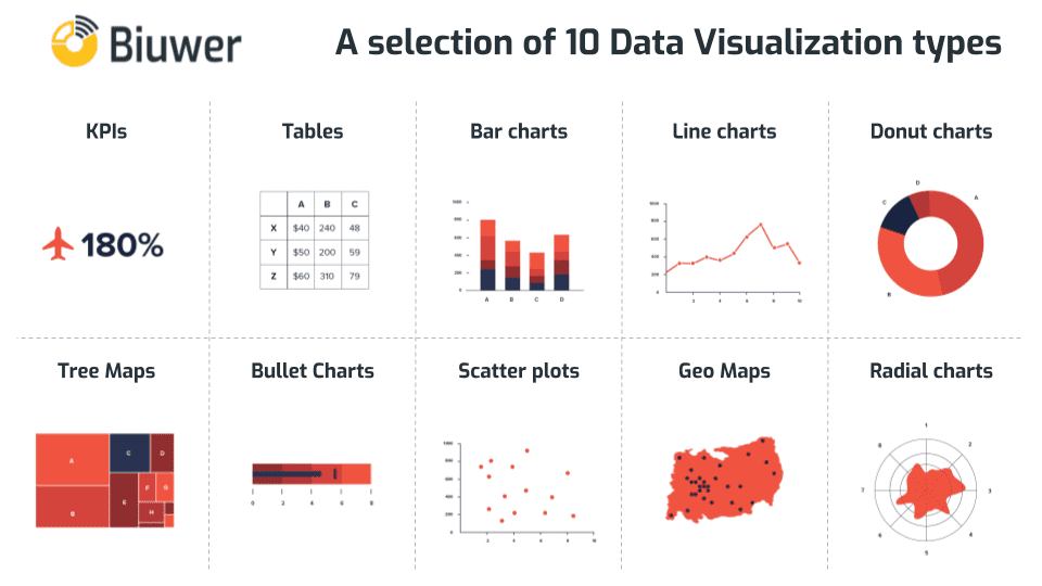
- Indicators and KPIs. They serve to highlight total numerical values, with multiple variants (colours, icons, comparisons, etc.).
- Tables. Mainly vertical tables and cross tables for more detailed analysis and with large amounts of data.
- Bar graphs. They have some variants, single bars, stacked bars, grouped bars, vertical, horizontal, etc.
- Line charts. There are also some variants, simple lines, ladder lines, etc.
- Donut and Pie charts. They serve to visually highlight few values, mainly categories. They should be used with caution as they tend not to be useful if the number of values shown is very large or very small.
- Tree Maps. They are very useful to give a comparative sense to the quantities and to highlight a ranking of values in a category from highest to lowest.
- Bullet charts. They allow to show visually the level of achievement of target values, as a thermometer. These charts can usually be configured with current values, target values and a set of traffic light colors.
- Scatter plots. They allow to compare two variables and to visualize correlations in a simple way. They can be completed with more variables to get bubbles of different sizes, colors and shapes, showing a large amount of information in a single chart.
- Geographic maps. Any data that refers to a geographical location makes sense displayed on a map. There are many variations, from point maps to area maps, heat maps, etc.
- Radio charts. They are important, because they allow to show with areas, lines and other shapes, the correlation between multiple dimensions of analysis. For example, the degree of strength of an element observed from several analysis axis.
Data Visualization use cases
There are multiple uses, probably as many as needs. Each type of data visualization can be used in different ways, some of the most common are:
- Changes in time: this is perhaps the most basic and common use, but possibly one of the most valuable. It is very common because most data have a time element involved. Therefore, the first step in many data analysis is to see how the data evolve over time.
- Frequency Determination: this is also a fairly common use because it applies to data that involves time, when you see how often the relevant events occur.
- Determination of relationships or correlations: this use is extremely valuable as it is difficult to determine the relationship between two variables without a visualization and is something that adds a lot of value. Using a scatter plot allows you to face two dimensions and clearly visualize how they are correlated.
- Value and risk analysis: in business terms, it is useful to visualize with color codes the formulas that indicate the amount of value or the amount of risk that a customer, a supplier or a project has.
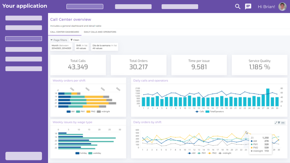
Building a real example
An online store wants to know how is evolving the average amount of the products they sell. The reason of doing this question is either to bet for massive selling of cheap products or selling expensive products in less quantity.
Starting from a database in Azure SQL Database, we follow the next steps in Biuwer:
- We set up the connection.
- We model the datasets involved.
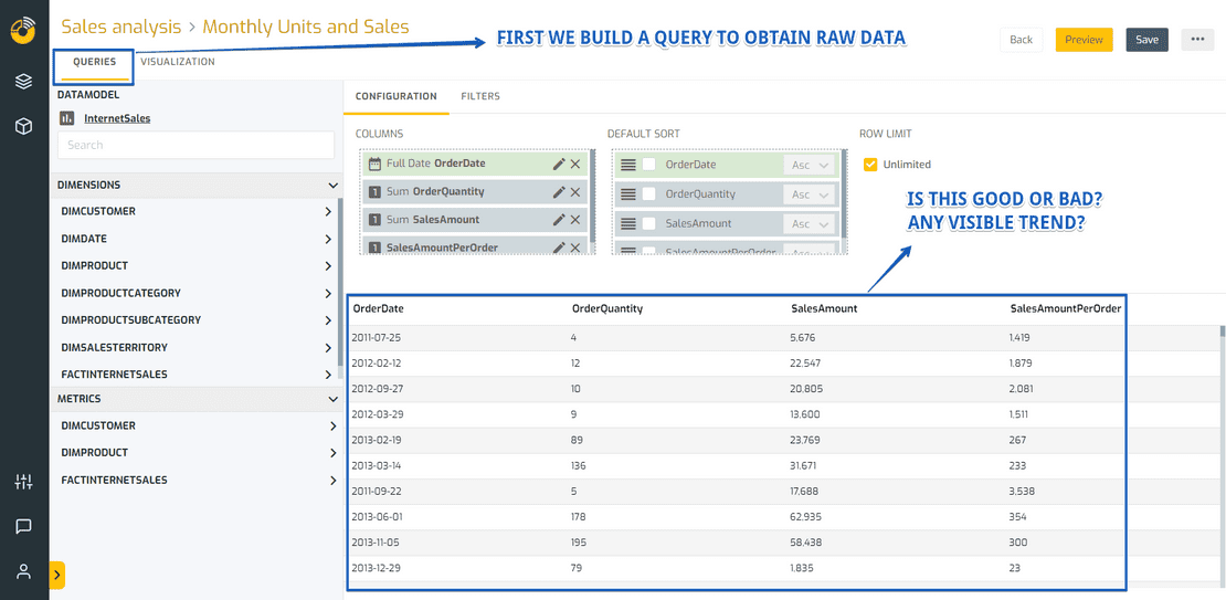
- We build the query to obtain raw data.
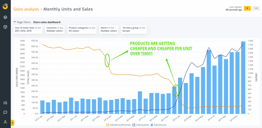
- We build a mixed chart with lines and bars, using multiple axis to visualize the total sales, the total number of orders and the sale amount per order.
The result of point 3 is a detailed data table, but we can’t extract any insight from here, at least at first sight.
However, after building the data visualization, it’s easy to see that the sales amount per order is decreasing and decreasing over time, with two major steps, that must match with two internal events in the company when they decided to change the product and sales strategy.
As you can read in this article, data visualization is a wide and versatil discipline and thousands of specialists are now needed in companies to bring sense to the massive amount of data generated every day.