Color is a fundamental element in charts and a good use of it will determine the success or failure of the interpretation made of the data shown.

The use of colors and their relationship with psychology has accompanied us throughout the centuries. The role that colors play in people sometimes goes unnoticed, but it is actually much more important than we consciously believe. Our decisions are largely influenced by what we see, and colors play a major role.
There are numerous studies that show that the strategic use of color conditions the way we learn, retain and even interpret what we see. Color is one of the elements that allow us to interpret information more quickly, therefore, a good use of colors will largely determine whether the interpretation is adequate or just the opposite.
Therefore, colors are a very powerful tool when visualizing data and so, throughout this article we are going to delve into 6 tips to make good use of color in data visualizations.
1. Using many different colors can make it difficult to understand the data
If the purpose of using colors is to facilitate the legibility of the information, the result can be the opposite with an excessive use of them, that is to say, using many colors can confuse us more than help us.
Studies show that people's brains are capable of holding up to seven colors at a time, which means that using more than seven colors can be counterproductive when interpreting information.
2. Use color to highlight those data that are important
Using intense colors for important information and duller or greyer tones for those that are not, makes it easier to perceive the data.
3. Choose colors that are easily distinguishable
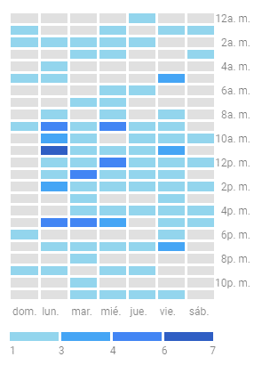
It is possible to use several shades of the same base color, but only if there is a difference in intensity between them, so that they can be distinguished from each other quickly and with little effort. In these cases, we recommend using color intensities that are easily differentiated from one another and that allow the user to clearly distinguish where each color begins and ends.
For example, in the following two-dimensional heat chart, typical of Google Analytics, 4 shades of blue visually distinguishable from each other, have been used:
However, it is advisable to use different colors that also allow for visual contrast.
4. Use contrasting colors to make visual comparisons
Besides the fact that colors are easily distinguished separately, it is important to take into account the contrast they make with each other when making comparisons between metrics, since it will always be easier to compare a red line with a blue one, instead of an orange one.
If we also use these colors taking into account the relationship they have with what is being analyzed, we will give a plus of meaning to the chart. Other examples of this would be:
- Use red for high temperatures and blue for low temperatures.
- Use the traffic light colors (green, yellow, red) to indicate to what degree is positive or negative a numerical value.
5. Relate color to what it represents
In line with the above, we must emphasize the importance of using color by associating it with the information being treated, so that everyone who sees the chart knows what each of the colors used refers to.
A good practice would be to maintain that association so that whenever a certain color appears within the charts of a given theme, it is associated with the same concept. This does not mean that whenever the color red appears in a chart it must be associated with heat or something negative, for example, since in another chart it may represent other meanings and in another it may be only one of the 5 colors that appear, without there being any further intention in its assignment.
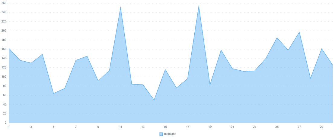
6. It is not necessary to use several colors to show temporal evolutions
When we are talking about time series of any metric, it is advisable to use only one color, so that it is understood that it is the same metric but extended over time.
An example of this would be a company's revenue over several consecutive billing periods, which can be displayed individually using a simple line chart or with a shadow applied.
To conclude, we will emphasize that the objective of these recommendations is none other than to facilitate communication in data visualizations through the use of color, but we cannot forget that this is only one of the many elements that can be used to achieve that task. So, the use of color will always be more effective if it is integrated with other elements such as shape, size, thickness or groupings.
Do you need help?
If you want to know more about how to apply color theory to charts, indicators, tables, etc. in your company's data analysis, the Biuwer team can help you with what you need. Contact us, we will accompany you throughout the process, offering you the best options for improving the performance of your company and without the need for previous knowledge.