Choosing the right chart is a fundamental task in order to guarantee a good communication and visualization of business data that allows us to make a good analysis.
The objective of this article is not to know in detail all the types of charts that you can use, but to help you select the best type of chart for your data, presenting you with some methodologies.
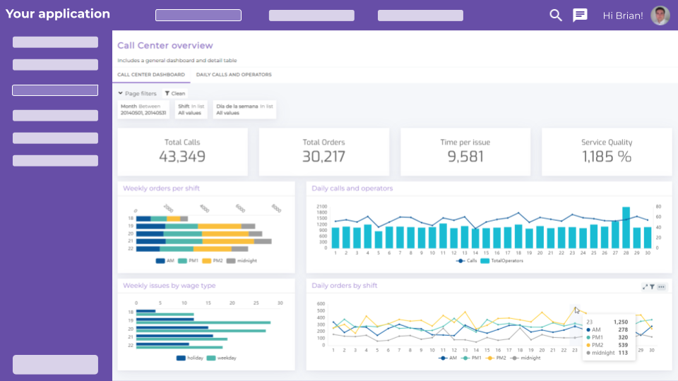
We make decisions every day in all areas of the company, some are of great importance, and if Business Dashboards composed mainly of charts are used to make them, we must know how to properly select these charts to be able to answer business questions clearly and with precision.
In this other article, we explain what data visualization is and the main types of data visualization that we can use.
Cloud data platforms, such as Biuwer, facilitate data management, but strategic planning and pre-design are still required. Identifying the objective behind each data question is essential to generate a good visualization, as it will guide the selection of the charts to be used.
These are some of the questions we should ask ourselves to ensure a successful choice of charts:
- What story do we want to tell or what do we want to convey to the public? By relying on data (statistics, metrics, numbers...) to tell something, we are strengthening and contextualizing the argument.
- Who are we going to tell? Knowing who will receive the message is essential to make sense of and adapt the information.
- Does the time factor influence the data that is being collected? In these cases, bar charts or dynamic line charts will be much more effective.
- Do we want to make comparisons of several sets of values? If the goal is to compare two or more sets of information, a bar chart will be more useful than a pie chart, for example.
- Do we want to show the different elements or an overview of the data? It will depend on this whether we choose a more detailed chart in which the whole composition can be seen, or one that gives a more global view.
- How do we want to show our KPIs? Bearing in mind what we want to get out of them, and how they will reach those with whom we share the information.
As you can see it is not a simple task. Asking ourselves, what is the ideal type of chart for my data?, sometimes there is no single or ideal answer. To help you choose between the multiple options, we present several methodologies that you can follow.
Dr. Andrew Abela’s method
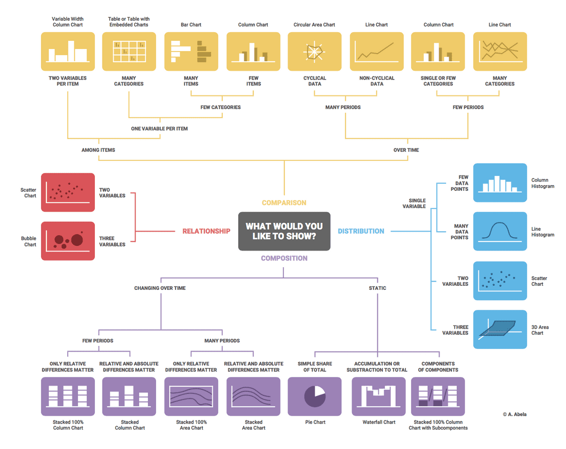
Perhaps the best known, it is based on a chart selection diagram created in 2009 by Dr. Andrew Abela as part of the Extreme Presentation method.
It all starts by asking what you want to represent with the data, and according to the answer the charts can be grouped into four main types:
- Comparison: when we want to compare the different values or attributes within the data with each other. There are some variants, depending on the data. For example: Does the data include the time variable? How many time periods? How many variables and categories do the data present?.
- Composition: when we want to know how the data is composed, that is, what general characteristics are present in the data set. There are some variants, depending on the data. For example: Are there changes over time? With how many time periods? In static data, do you have values that accumulate?.
- Distribution: when we want to understand how the individual data points are distributed within the entire data set. Depending on the number of variables in which we want to analyze the distribution, we can choose bar charts, line charts or scatter charts.
- Relationship: in this case we are interested in knowing how the values and attributes are related to each other. To face the values, scatter charts are usually used when two variables are involved, and bubble charts are used when three variables are involved.
Of these four types, it is most likely that in the majority of cases the first two, Comparison and Composition, will be used, unless you have advanced statistical analysis needs.
As you can see, most cases can be solved with a few types of basic charts, although multiple variants can be applied for each specific case. We can say that the most used charts are those of bars and lines in all their variants (horizontal or vertical, simple or stacked, etc.). When great detail is required, the data table is generally used.
The Data Viz Project
If you access ** The Data Viz Project ** website, several alternatives appear in the Function menu that help us select from a set of charts according to the function we want to apply.
For example, if we select the option Trend over time they offer us, among other options, the following:
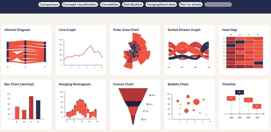
In this case, the set of charts shown is very wide and should be taken as possibilities that must be analyzed in each case with caution, depending on the nature of our data.
Undoubtedly, this project is very didactic and has specific pages for each type of chart, in which, as a detailed tab, it indicates a description for its use, the functions it fulfills, the necessary data format and a good list of examples.
From data to Viz
If you access the From data to Viz website, you can also have recommendations on the type of chart to use according to the role it should play with your data. This case is also very visual, and labels the different charts by color.
For example, if you want to represent a ranking between elements (TOP / BOTTOM), these types of charts are proposed:
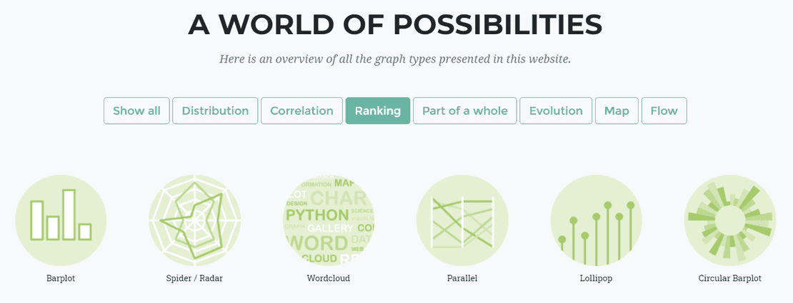
As in other cases, we recommend carefully analyzing what you want to achieve and the format of the data you have, to properly select a specific type of chart.
Data Viz Catalogue
Similar to the previous cases, on the web datavizcatalogue.com you have a search engine for chart types according to their function.
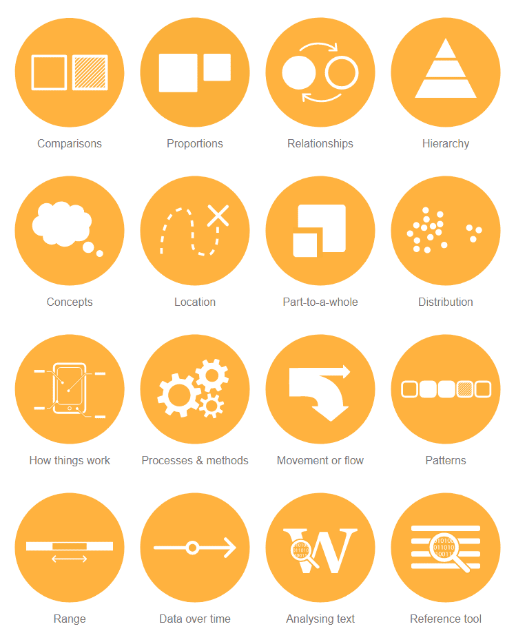
In addition to the classic functions that charts can perform, in this case they show us other not so common ones, such as:
- Hierarchies
- Processes and methods
- Movement or flow
- Ranks
Conclusions
Selecting the most appropriate type of chart for our data is an important part of being able to extract the most from it. As a rule of thumb, a chart should be able to visually answer the questions we ask about our data.
For this reason, we usually recommend using charts that are as simple as possible within the function they must perform. This will allow them to be clearly interpreted and we will be able to obtain the information patterns present in our data with sufficient analytical meaning to allow us to answer business questions.
As you have been able to verify reading this article, the information displayed in a chart depends directly on the type of chart chosen and this choice conditions the interpretation of the data and, consequently, the decisions made in this regard.
Once you have selected a good type of chart, all its configuration (axes, colors, contrasts, labels, sizes, etc.) comes into play, which will allow you to customize your charts in the essential task of ensuring good communication.
Data platforms such as Biuwer make available to all, the necessary tools so that, without prior knowledge, companies achieve their full potential with a good analysis of their data. If you need a very specific type of chart that is not in the standard Biuwer catalog to use it on the platform, we can create it for your Organization. If you still don't get the most out of your data with charts, don't wait any longer and start improving the performance of your company now.